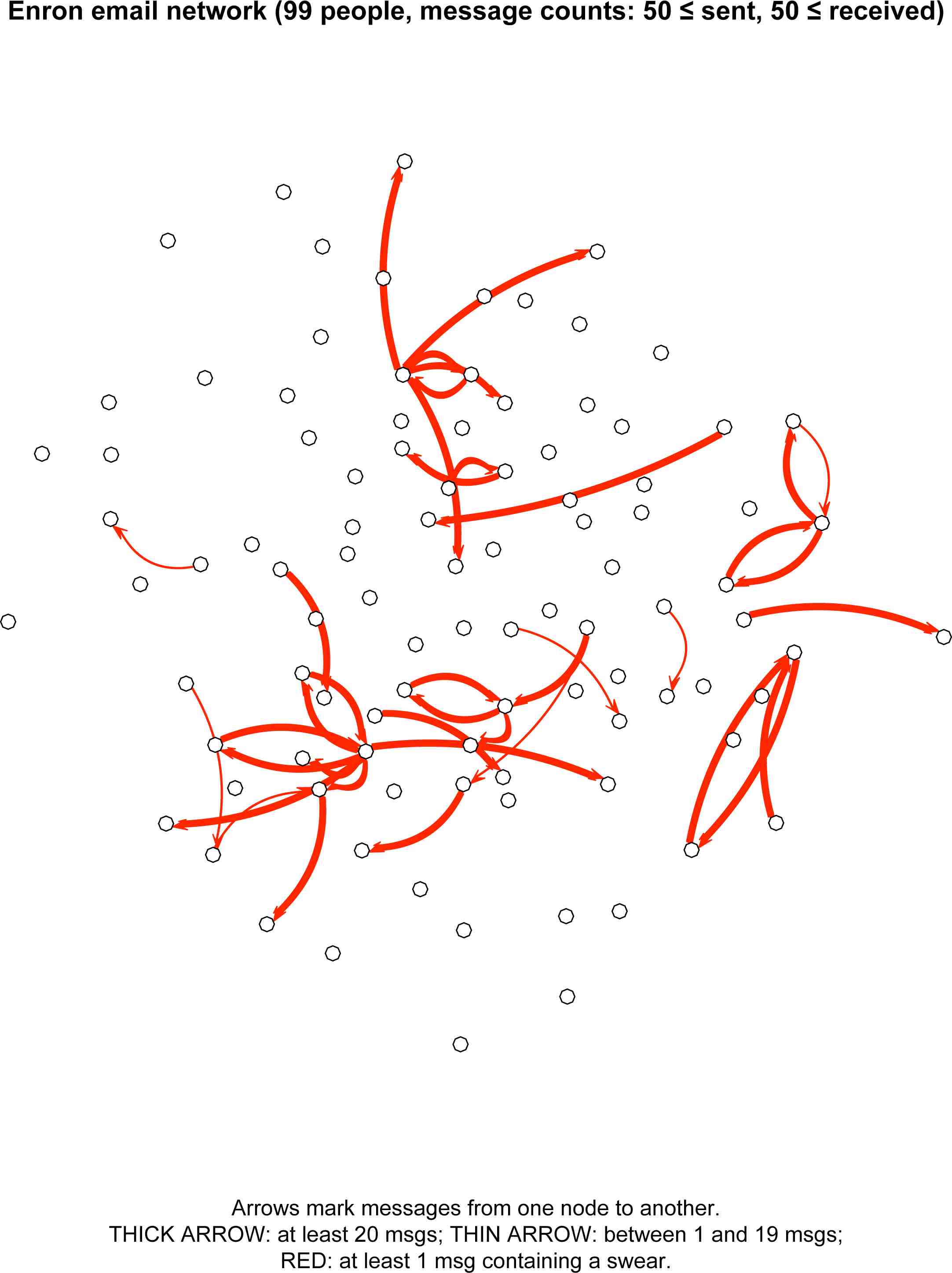
The Enron email dataset provides a nice chance to test out these claims. It is large (about 250,000 distinct messages, sent and received by over 11,000 distinct email addresses), and it contains a moderate amount of bad language. Not everyone swears, but a fair number of people do. The topics range widely: fantasy football, faith, energy markets, vacation time (and of course bankruptcy and the FERC). So, with some qualifications that I'll get to, it is a useful testing ground for claims about swearing and risky verbal behavior. The following email network graph is my first stab at conducting such a test:
The nodes represent 99 people with Enron email addresses who had relatively high email traffic in the dataset: at least 50 messages sent to other people in this group of 99, and at least 50 messages received from other people in this group of 99. (Messages that included any outsiders in their "To" lists were excluded.)
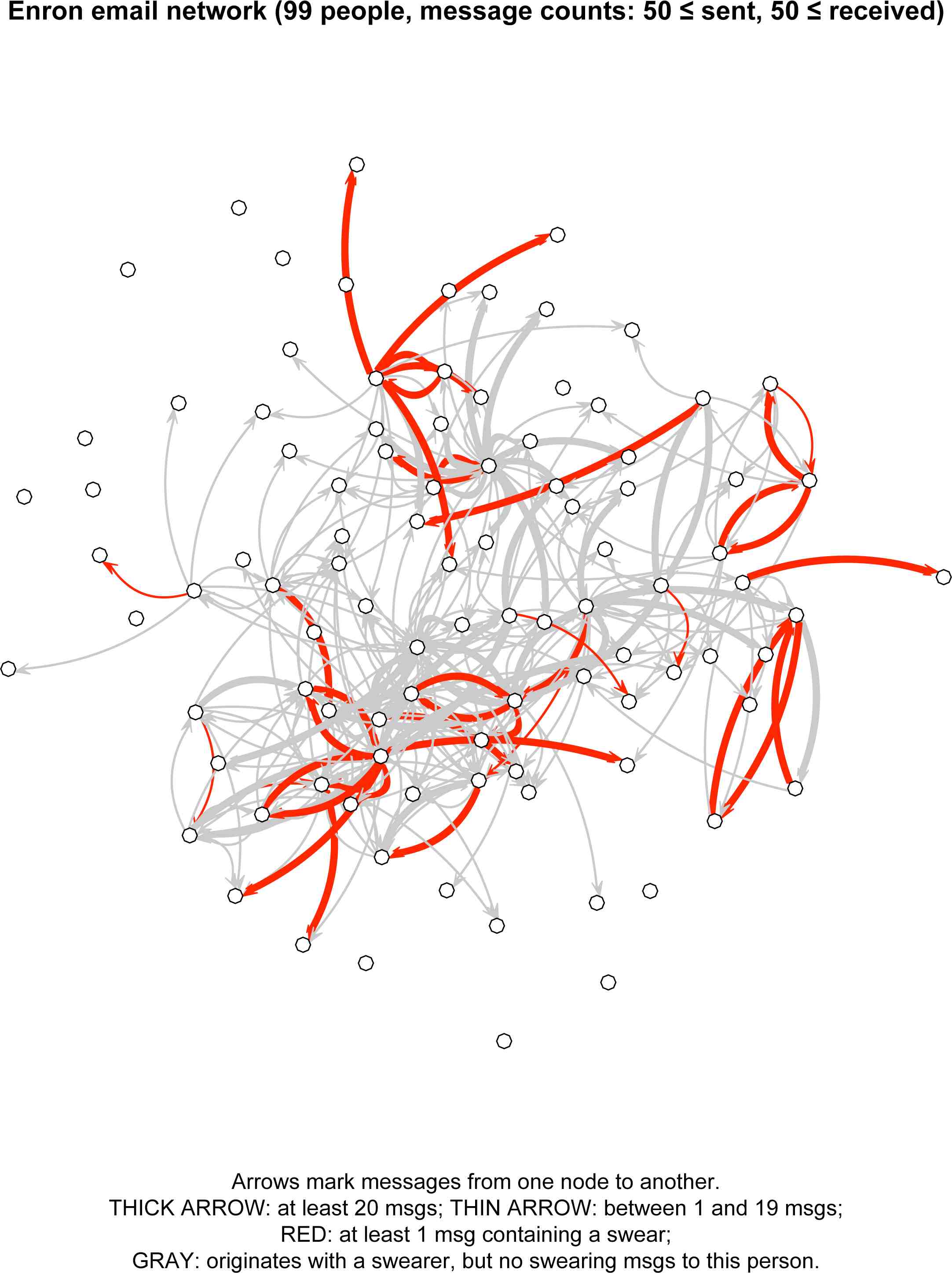
- A red arrow from node A to node B means that user A swore in a message to user B at least once.
- The thickness of the arrow's line represents the amount of traffic from A to B: a thick arrow from A to B means that A sent at least 20 messages to B, and a thin arrow means A sent between 1 and 19 messages (inclusive) to B.
The different line thicknesses might be hard to see at first, because the vast majority of the lines in this network are thick. I claim that this is no accident. It reflects the fact that, in this corporate setting, swearing is risky enough that it is best done only with people you know well. Your first few messages to someone are unlikely to contain swears, but you might build up the courage over time.
I can quantify the visual impression that these arrows are mostly thick: just 1.6% of the possible from–to pairs in this sample set have message counts of 20 or more, whereas 78% of the from–to swearing-pairs have message counts of 20 or more. If you squint, you can see this contrast reflected in the following version of the network, in which a gray arrow from A to B means that A swore at someone or other in the sample but sent only swear-free messages to B in this dataset. (Note: This is an update/improvement; the previous visualization included arrows for nonswearers as well, which resulted in a mass of gray in the middle of the network. My thanks to Dougal Stanton for the suggestion in the comments.)
There is one effect that I expected to observe but did not. Because swearing is risky, the safest situation in which to swear is one in which your hearer has already sworn with you. Thus, I expected most of the red arrows to form symmetric pairs. (See also this post on Jamie Pennebaker's work.) In fact, very few red arrows run in both directions in this sample. I suspect that this is due to a major drawback (for my purposes) to the dataset: many of these relationships are hierarchical. It's one thing if Skilling calls you or someone else an asshole, and quite another to use that as an invitation to do some swearing yourself.
In closing, thanks are in order: to the people behind statnet, the amazing R library that let me build the above networks using just simple matrices of counts, and to all the people who worked to tame the wild Enron dataset, especially Andrés Corrada-Emmanuel for his tools for identifying users and removing repeat messages.
Original here


No comments:
Post a Comment